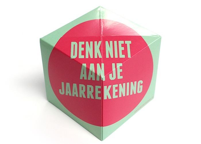
An advertising mailing as we have not often seen. The design is exciting. The surfaces are not individually made up, but the design flows over into the different surfaces. This creates a playful effect. With three colors and two clear sentences, Lakarsk opts for a very special and concise way of advertising. It certainly arouses curiosity. Because if you are not yet triggered by the pop-up effect of the cube, you will want to know for sure who this advertising mailing comes from after seeing the design. The only indication for this is present on the mailing is the URL Denknietaan.nl.

Offline advertising mailing with online referral
The landing page, the URL of which is stated on the advertising mailing, is completely styled. On this page the cube is visible in an interactive 3d view which the reader can rotate by dragging the mouse. On this page, Lakarsk pulls out even more. A mental game with a purple polar bear makes the reader think. Because who cares about your annual accounts, VAT return and quarterly figures if you prefer not to? They take care of all administrative matters that you would rather not think about. After a few seconds you will be automatically redirected to the website of the accountancy firm, and how else can you delve into the services they offer.
Using Out of the Box as advertising
If we look at all the ways in which the Out of the Box mailing has been used, we see that no mailing is the same. For example, many companies choose to design the six faces of the cube in the same style, but separately from each other, but there are also companies such as Lakarsk that choose to use a creative Out of the Box to make. The cube has a lot of possibilities in terms of design, communication and purposes. Are you curious whether this product is also suitable for your advertising mailing? Request a free sample or quotation via the site direct mail or get advice from one of our employees by contacting us.


